Simplifying credit scores
My role: UX and content design lead, responsible for analyzing user data, defining information architecture, and gaining stakeholder alignment.
Skills: Information architecture, behavioral analytics (using Adobe Analytics), content strategy, user research
Company: JPMorgan Chase
Collaborated with: Product managers, UX designers and researchers, developers
Background
During this project, I was the content design lead on Credit Journey, a consumer credit monitoring tool that helps people track and manage their credit score. Data from our call center and feedback surveys showed that although the product was widely used and had strong engagement, many users were confused about how their scores were calculated and what causes them to change.
By redesigning a key feature of the product, we significantly improved user’s understanding of the factors that make up their credit score, with research participants showing a 62% improvement in their understanding of credit factors. After launch, engagement with the redesigned pages increased by between 50% and 125%.
The Challenge
How might we help users better understand their credit score?
The team had identified several key points in the user journey where we could help solve this problem. Although we knew the most impactful opportunity would be to improve the product’s main dashboard, due to technical constraints we weren’t able to start there. Instead, we started with a set of secondary and tertiary pages that gave users an in-depth look at the factors that impact their score and how they’re doing in each area.
Although less visible than the dashboard, these pages received hundreds of thousands of views each month, so we knew there was an opportunity to better inform and reassure users who were already looking for more detailed information about their score. I conducted a heuristic analysis and content audit and determined that the pages had numerous usability issues and content gaps. I also reviewed prior research from an earlier redesign, which had been put on hold, to inform design decisions in this project.
Heuristic analysis and content audit
-
Educational information was presented in dense, hard-to-parse blocks of text.
-
Redundant information made the pages repetitive and difficult to scan.
-
Explanations used industry jargon, further confusing users.

-
Styles and components didn’t align with design system standards, making the experience feel disconnected from the larger Chase app.
-
We defined the information architecture for the pages and uncovered more nuanced user needs through a collaborative conversational design exercise.
-
We sketched low-fidelity ideas for the redesigned pages and then worked up to high-fidelity prototypes.
-
I collaborated with our UX research partner to design and set up an unmoderated user test, using a mix of quantitative and qualitative methods to evaluate the success of our designs.
Discovery
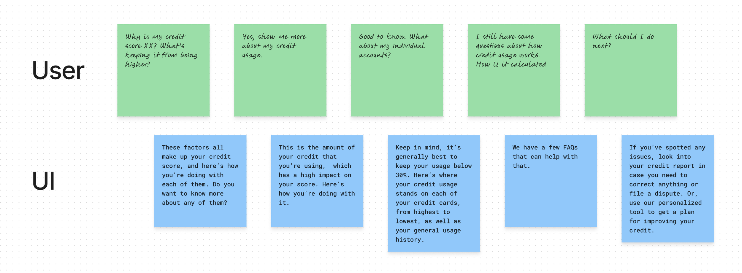
Through a collaborative team exercise, we outlined the information architecture for the experience and aligned on the data points we would need to show to help users understand each of their credit score factors.
Conversational design

Wireframing & prototyping
Using the outline from our conversational design exercise, we sketched wireframes of the page and outlined key data points we’d need for each page. Once we’d aligned with product stakeholders on the wireframes, I worked with a UX designer and another UX writer to develop high-fidelity prototypes for user testing.
I collaborated with a UX research partner to develop a test that could help us assess if we had achieved our goal of helping users improve their understanding of credit score.
We designed a quiz to baseline participants’ level of credit score knowledge. Participants took the quiz, explored the prototype, then took the assessment again. We tested both the old and new designs with separate user groups and found the new design resulted in greater improvements in participants’ credit knowledge, and it received better qualitative evaluations.
User testing
Final designs
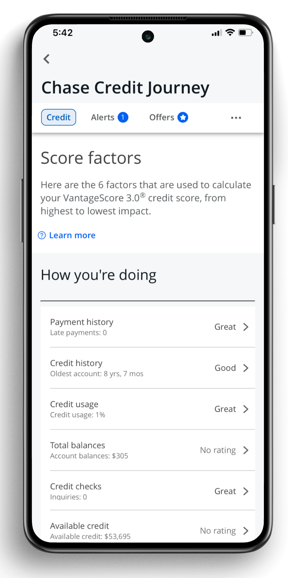
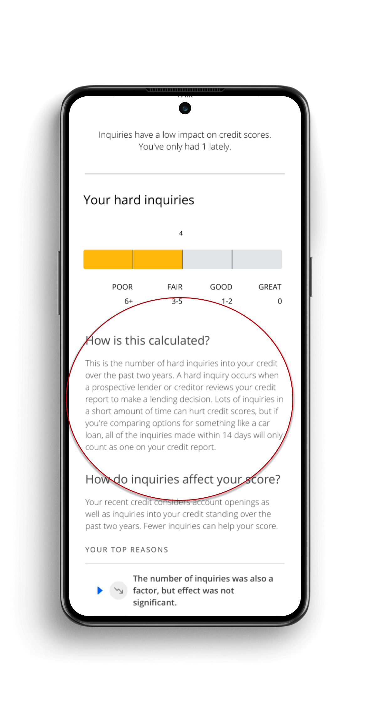
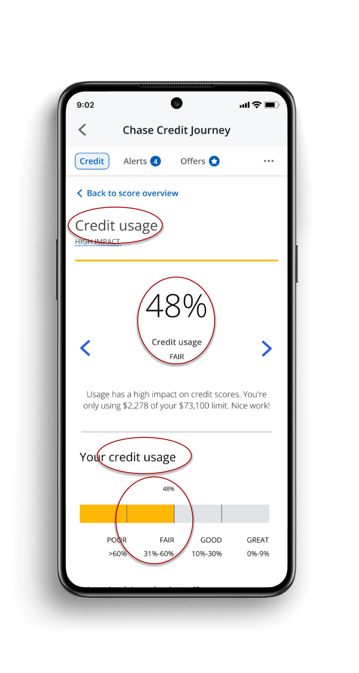
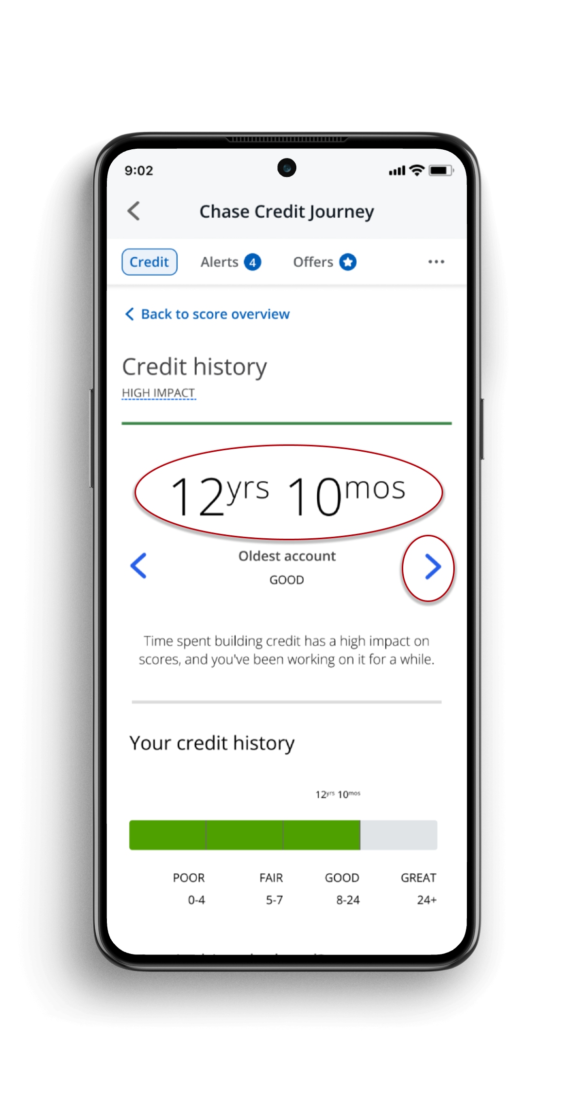
A concise overview shows users where they stand at a glance.
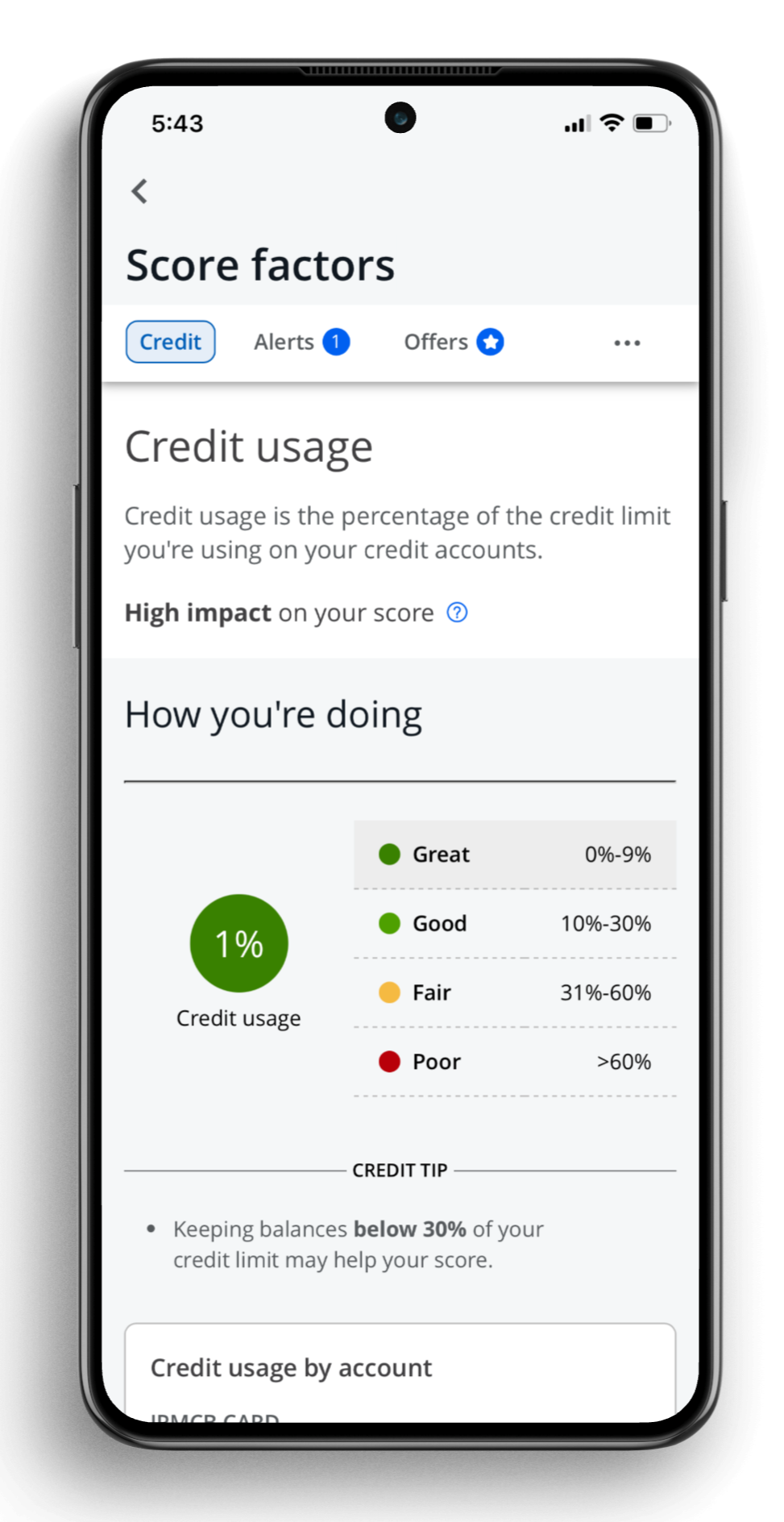
A summary explains each factor's significance and the user's current standing.
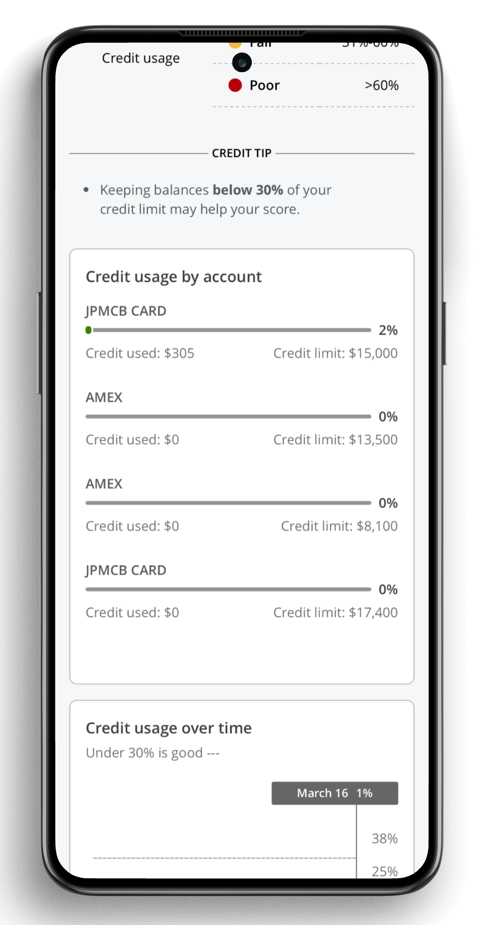
Quick tips paired with relevant account data provide further detail.

Embedded entry points to other relevant tools and resources allow users to take next steps.
Results
Up to 125% increase in visits to redesigned pages
Positive qualitative feedback:
“It helps me understand which area I need to improve.”
“This is overall my favorite page/feature.”
Increased acquisition through new cross-product promotion placements
Although I knew the limited scope of this project meant we weren’t going to completely solve our core user problem, it was a starting point. While addressing the full end-to-end user journey for understanding a credit score likely would have made a bigger impact, this more limited scope still delivered results and moved the overall experience in the right direction.
This was also a great opportunity to build strong working relationships with the product team, as I was relatively new at the time. The research and engagement data after launch were also an asset to myself and other content designers on the team going forward, as they demonstrated how much of an impact thoughtful content design can have on user behavior and satisfaction.