Better budgeting
My role: Lead content designer, responsible for developing content strategy, contributing to design ideation and high-fidelity prototypes, and delivering final UX content.
Skills: Content strategy; UX writing; information architecture
Company: JPMorgan Chase
Collaborated with: Product managers, UX designers and researchers, developers
What we did
We redesigned the bank’s in-app budgeting tool, improving the feature’s customer satisfaction score by 85% and increasing sign-ups by 16%. This lifted overall engagement with the company’s suite of personal financial management tools, one of the team’s core goals.
The Challenge
How might we help users manage their spending so they can save more?
Managing spending was a high priority for the bank’s customers, according to prior generative research. When I joined the team, the bank’s app and website already had a budgeting tool available. We knew there was demand for this kind of budgeting or spend management feature, but the current design wasn’t working. Many users had attempted to set up a budget or even gotten as far as tracking their spending for a couple months. But return engagement rates and satisfaction scores were very low, and qualitative feedback revealed issues on multiple levels:
Users didn’t understand the underlying budgeting model;
The UI content and data visualizations caused confusion;
Key functionality that users expected from budgeting tools, like the ability to budget for specific spending categories, were missing.
Moreover, the bank had another, separate spend tracking feature. Despite their overlapping purposes, the flows were completely separate. Key data points, like total spending, also didn’t match up between the two, frustrating users who checked both.
Discovery
We identified pain points and opportunities in existing user journeys and used impact-effort prioritization to align on a solution.
User journey mapping
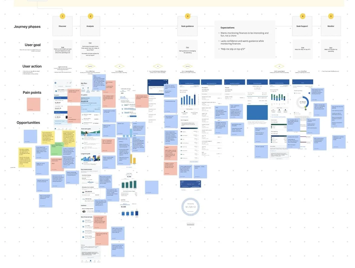
We identified pain points and opportunities throughout the existing user flows related to tracking spending within the app. This was informed by qualitative feedback and behavioral analytics.
Including cross-functional partners, such as product, developers, and line of business stakeholders, at this stage helped us gather a range of perspectives and build alignment from the start.
Impact-effort prioritization
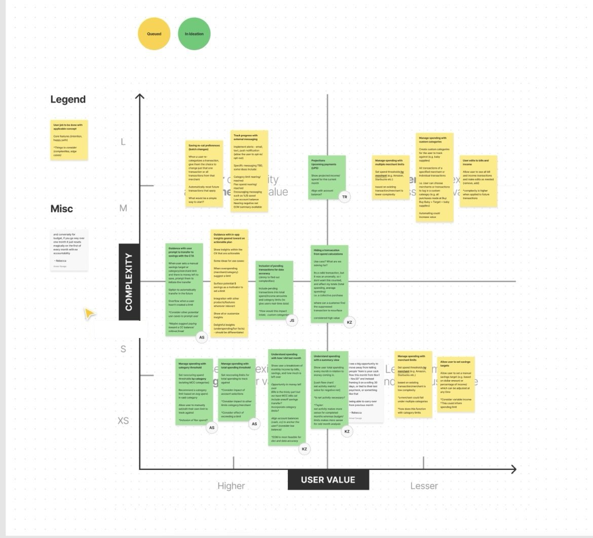
We consolidated the pain points and opportunities from our user journey analysis into a set of user needs related to tracking and managing spending, then worked with our product and tech partners to map them based on user impact and technical feasibility.
This became both a scope definition for our MVP and the foundation for an outcome-based roadmap after initial launch.
I and the other designers sketched low-fidelity concepts. We explored integrating lightweight budgeting features into the existing spend monitoring experience, or developing a more robust budget tool that would be on par with our fintech competitors’ offerings. As a team, we decided the more robust budget tool approach would better meet the needs of our target user group and moved ahead with refining this design approach.
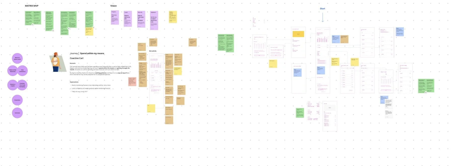
Low-fi wireframing
Prototyping and usability testing
I drafted UI content for high-fidelity prototypes and collaborated with a UX researcher to plan moderated usability testing.
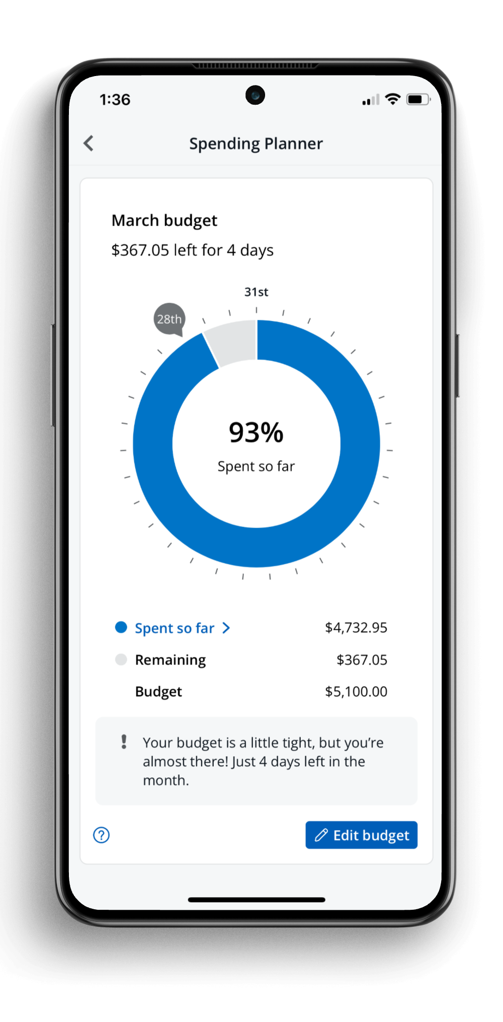
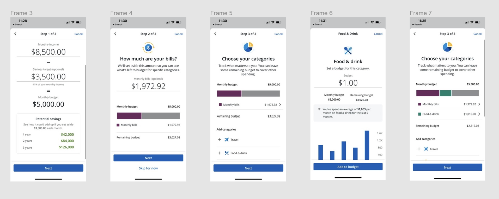
This testing helped us validate that the income-based, savings-first budgeting model we’d used worked well for users, resolving a core issue with the previous experience.
We also identified and resolved some points of friction. For example, I’d chosen to use the word “limits” to describe the user’s desired maximum category spend amount, but users were confused by the term. Particularly in the context of their banking app, some associated it with a credit card limit, and thought we might even decline transactions in that category if they hit the limit. I switched to using the term “budget” throughout for both the overall monthly and individual category budgets, which proved to be much more intuitive to users.
Key Features
-
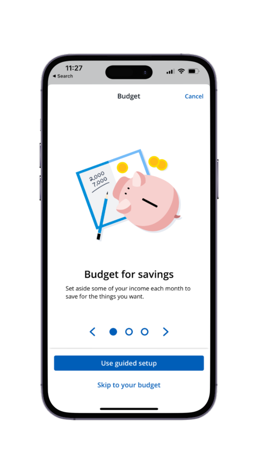
Savings-focused budgeting
Our design approach focused on the desired outcome (saving more) to motivate users.
-
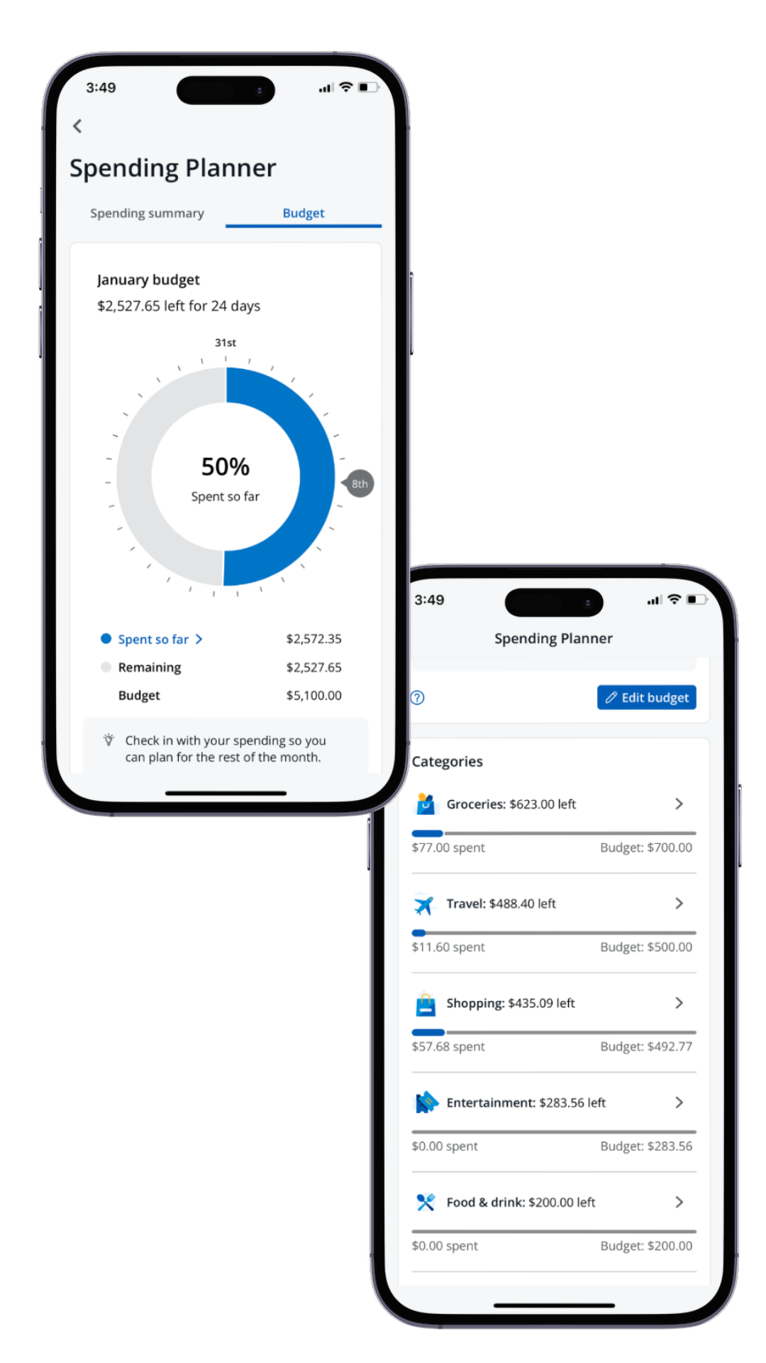
Spend tracking flexibility
The tool offers both an overall monthly budget and category-level details, allowing users to choose how much they want to fine tune their budget.
-

Conversational content
No jargon or odd vocabulary - the UX content reflects how our users actually talk about their budgets and spending habits.
Results
85% increase in overall satisfaction
31% increase in monthly active users
16% increase in successful budget set-ups
Following the initial launch, our team continued to iterate on the experience. Early user feedback confirmed many of our hypotheses about key post-MVP enhancements, such as transaction recategorization and the ability to “hide” certain transactions from spending totals.
Facing the shortcomings of the previous design head-on helped the team stay focused on meeting user needs, instead of expecting them to adapt to our design choices or accept confusing limitations. Additionally, the team’s collaborative approach allowed me to influence and help define the flow and information architecture from early. The level of fidelity for the content, interaction and visual design all evolved together, leading to a more cohesive end result and more efficient design process overall.
You can learn more about the feature on the Chase website. If you’re a Chase customer, you can find the spending and budgeting tools in the app - drop me a note if you try it out!