Creating continuous engagement
My role: Lead content designer and experience strategist. I developed the overall design recommendations and wrote the content for the full user journey.
Skills: Experience strategy; UX writing
Company: JPMorgan Chase
Collaborated with: Product manager, UX designer, developers
How might we…
Make it easy for users to continue improving their credit score?
About a year prior, the Chase Credit Journey team had launched a feature that gets at a key user problem - how do I improve my credit score? The feature gives users a plan based on their credit report and accounts, and a projected amount they could improve their score by if they complete the plan steps. It exceeded all expectations for engagement and was measurably helping users increase their score.
However, the end-of-plan journey was disconnected, leaving users stranded at a key moment. It was very successful at getting users to start their first plan, but what about when they get to the end?
Auditing the experience
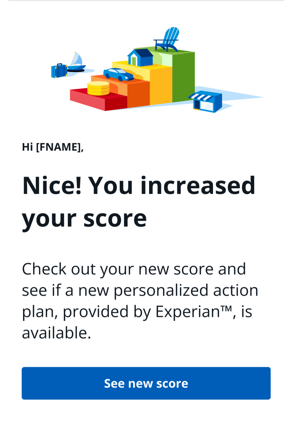
When a user completed their plan, we’d send them a notification email:

The content strategy for this email was flawed - first, we tell them the result (that they achieved their plan), and then the CTA says to get the result (which they already know). The actionable next step to start another plan was buried in long subcopy below the CTA that resembled a footnote or disclosure.
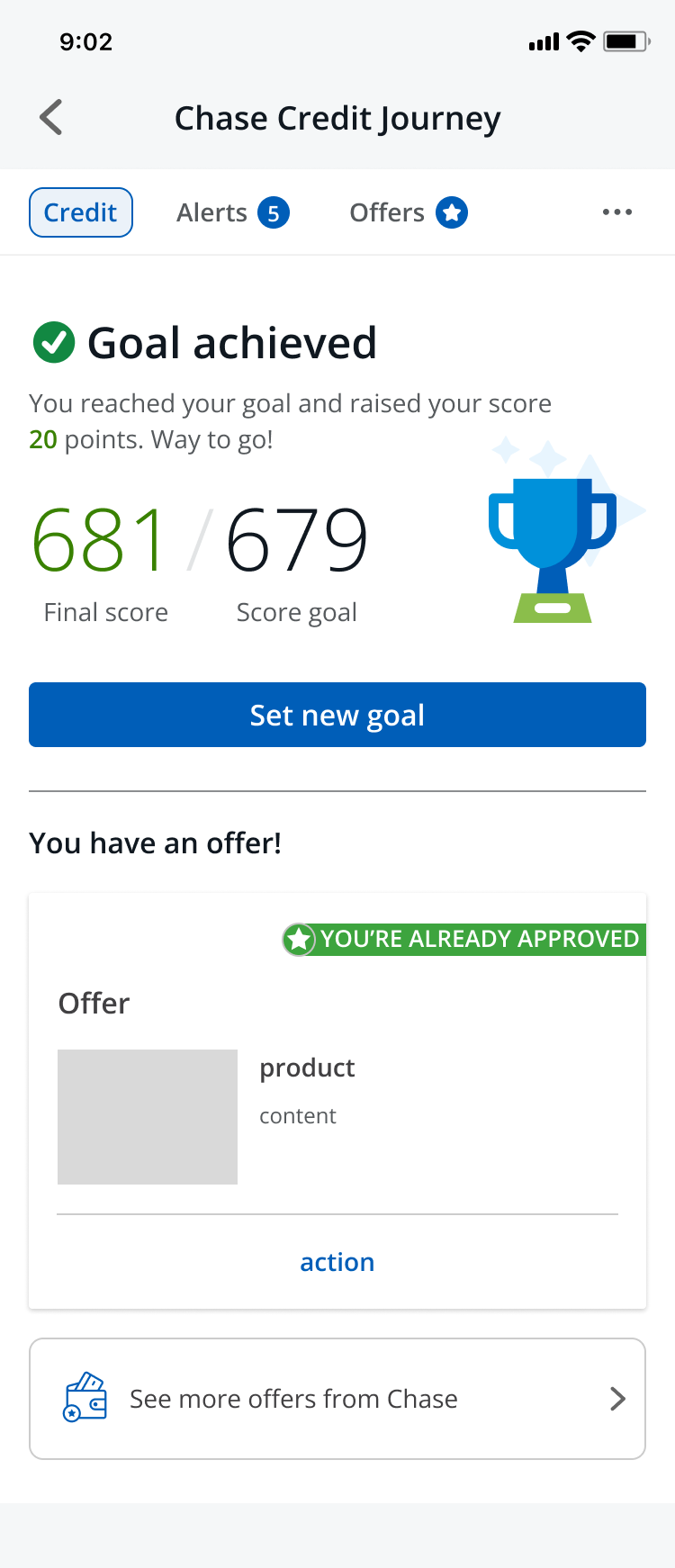
If a user does click on the CTA, they land on this summary page stating that their goal was achieved. But now what? There's no clear next step.
The user has to scroll all the way down here to see anything about starting a new goal - we had even received calls from users who had reached this point and had to call to find out where to go next. Furthermore, the heading is a somewhat ambiguous question, rather than a concrete action.
This was both a gap in the user journey and a missed opportunity to deliver more business value. If we could increase the rate at which users who complete a plan subsequently start another one, we would improve user outcomes, which also makes them stickier customers and increases the chance that they’ll acquire additional products from the bank.
The solution
Fix the summary page hierarchy so the CTA is prominent.
Adjust the UX writing to be more concise and action-oriented in the email and the app.

